MARK YOUNG
SENIOR UX DESIGNER

A CASE FOR SIMPLIFICATION
Product: Carrier 360
Role: Senior UX Designer
Tools: Figma, Adobe XD, Figjam, Sketching
Methods: Cross-team collaboration, Analytics, User Interviews
TL;DR
-
It can often be worth completely scrapping bad UX rather than trying to fix it.
-
Complex problems don’t always require complex solutions.
-
Listen to the data and respond accordingly.
-
Listen to your users and give them what they want.
-
KISS. Keep it simple stupid.
Product Overview
Carrier 360 is one of J.B. Hunt's customer facing applications that allows Carriers (independent truck drivers and transportation companies) to find, book, and execute loads.
Discovery
Users of the Carrier 360 application have a very specific goal in mind: Easily find, book, and execute loads. Not only is this the main goal of the users, but it's also a shared goal of J.B. Hunt as a business. Though various methods of research, we have found that over time past business and UX decisions have introduced speed bumps to this process. If we know as an organization that most of our users are in Carrier 360 to find loads, why would we ever land them on a home page with more than a dozen options to choose from? The cognitive load asked of our users in this scenery is unnecessary. The question quickly becomes how might we lower this cognitive load and how do we get users directly to what they want the most efficient way?
Let's look at the landing page where users currently arrive.

On one single screen we have over 19 options available for a user to choose from. Many of which are duplicate menu items. Widgets can be a powerful tool if they provide valuable and actionable information that helps inform users in the decision-making process, but in this case, these "widgets" simply serve as buttons.
As I often like to say, "Complex problems don't always require complex solutions" and likewise, sometimes the problem is so obvious it can be solved by simply eliminating the problem altogether. In this case, why have a home screen at all if it's providing no value and impedes the end goal of the users as well as the business?


Bells and whistles are nice if they add value. Carrier 360 is a productivity app and the bottom line is that our users care very little for anything outside of the core functionalities that help them do their job. Let's give them that no-frills experience.
Design Process
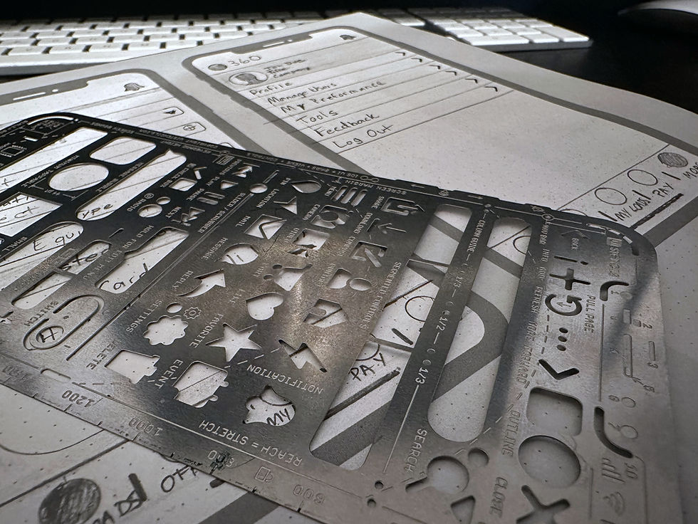
I'll be the first to admit - I don't always love doing a bunch of pen and paper sketches. I have found that effective designers can often jump right into the software of their choice and start building ideas. In this case, though, I felt it was important to at least provide some very simple ideas on paper before jumping into any major design decisions.
The basic idea at this point was to remove the homepage all together. Doing so may sound simple, but this still leaves several problems to solve for.
-
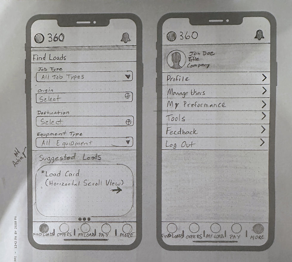
Where do users land on entry to the app? Users want to find loads and book loads, let's send them directly to that experience.
-
Where do we put all these menu items? I'm a huge fan on presenting users with the 'meat and potatoes' of their desired user experience while allowing easy access to less used features through a 'More' menu option. You'll see in my final designs that this solution is also very scalable for enterprise applications, as they often have very large sets of available features.
-
What will this 'More' page look like and what should it include? I looked at several commonly used applications for inspiration as well as pulled from previous research to inform my decision of what items should be included.
-
Is this change going to solve for the original problem? With the defined problem that users need to get directly into the experience of finding and booking loads, this not only solves the problem, but builds a better menu structure and hierarchy for future features.
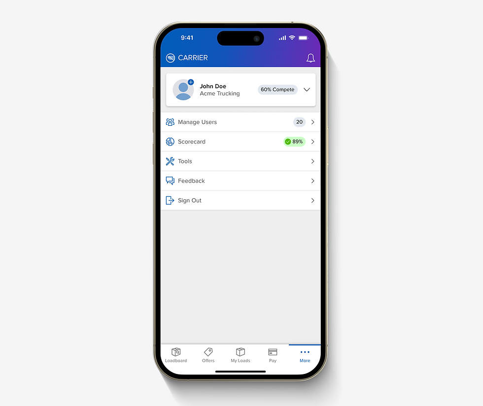
Final Design

Impact and Learnings
Ultimately, the impact of these design changes will result in users no longer hitting unnecessary speed bumps in accomplishing their main goals. This solution also lowers the cognitive stress on users in making decisions. In my experience, the simple solution is almost always the best solution. There's a lot more to UX design that just scrapping bad user experiences, but this can sometimes be the best path forward.
KISS: Keep It Simple Stupid.